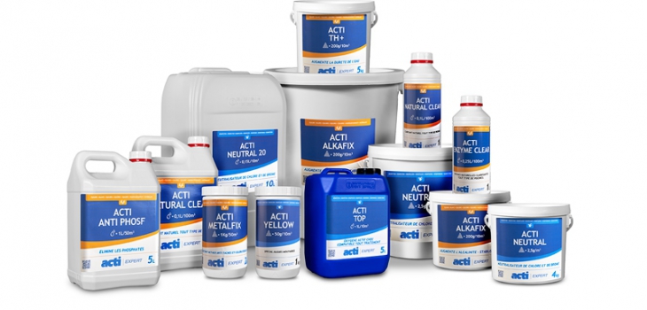
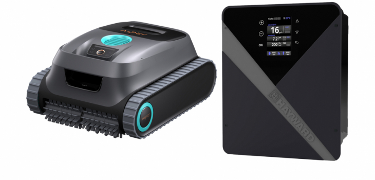
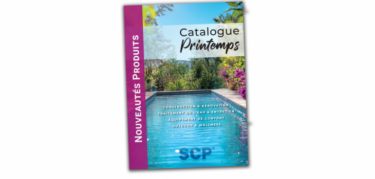
After consulting the group's subsidiaries following a market study conducted among pool customers, SCP Europe decided to upgrade the packaging of its own ACTI brand.
Why? Firstly because the graphic of the swimmer used for several years, needed to be revamped. Also, the goal was to give the brand an image that was more upmarket, and at the same time impart a graphical consistency between the various product fields: Generalist, Spa, Expert and Hp range.
The new image of the brand thus wishes to convey the following values: simplicity, modernity, differentiation and professionalism.
The label is simple, streamlined, without frills and goes straight to the basics: identical trade and generic names in each language, pictograms quickly identifiable, recommended dosages in easy-to-read text, etc.
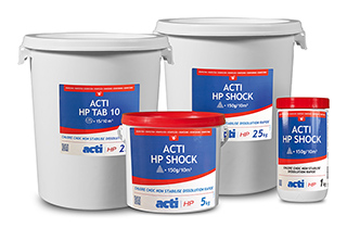 Modern, the Acti logo is put forward in a unique version for each of the product families (Acti Expert, Acti pH, Acti).
The pictograms of contents and packaging (tablet, stick, gel, pellet, powder, granule, liquid) allow one to identify the type of formulation and dosage rapidly.
The site www.acti-chemical.com is also emphasised with the use of a QR code on the product label.
With the new colour code it becomes easier to quickly and clearly differentiate the ranges on the shelves: yellow for water balance, blue for disinfectants and anti-algae, green for special uses (wintering, filter cleaning, etc.) and red for un-stabilised chlorine (calcium hypochlorite).
Ultimately, the new identity of the brand targets the professional, leaving behind its obsolete general public image.


