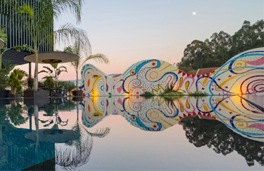
The manufacturer of hot tubs and swimspas starts a new era
Aquavia Spa, the manufacturer of hot tubs and swimspas, presents its new corporate image. The company has decided to reinvent itself and start a new era, with more than 30 years of experience that guarantee the quality of its wide range of products.
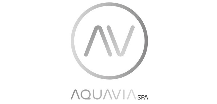
A new logo
The new logo has been developed based on a design of simple and balanced lines, easy to adapt and with the aim of gaining visibility without losing the brand essence. The change of font to a sans-serif one and the new silver toned palette provide the necessary nuances of design, innovation and exclusivity to approach the potential target. This differentiation also gives the logo the added value of quality, and is a distinguishing trait together with the technological advance.
This new design is based on the premise of creating a unique and readable logo that defines the company's mission and values.
A message reinforcing the brand image
As for the imagotype, the circle symbolizes perfection and eternity. Whithout beginning or end, it is used to represent movement of the water. The circular shape tends to project a positive emotional message reinforcing the brand image and in turn serving as a stamp of the firm.